close
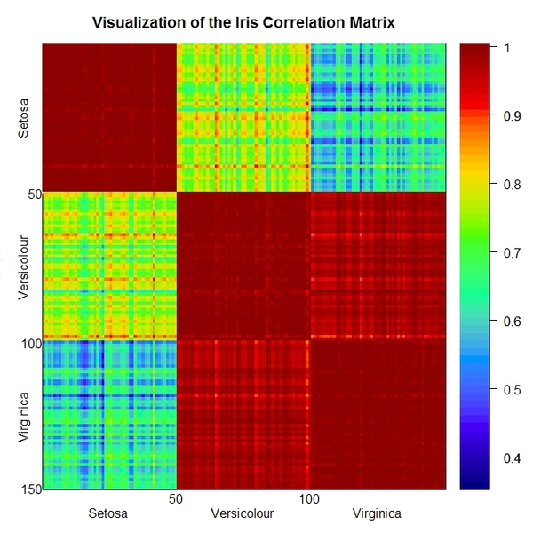
I just learned to draw this graph by R.
It's a homework from Data Mining.
Somehow it looks pretty fancy for solving some complicated problems.
In fact, it's nothing a correlation matrix but replacing the numbers (coefficients) by distinct colors providing much different experience than traditional techniques.
More friendly, more intuitively.
That's the way should be and I like.
全站熱搜

 留言列表
留言列表
